There are two devices operating at my home in east Tucson, Arizona, that continuously monitor the brightness of the night sky from my location and report their results on the web. Between these two instruments, I have built up a dataset since mid-2017 that is useful for monitoring the evolution of skyglow at my site.
The devices
The photometers were built by two teams at universities in Spain. They were developed as part of light pollution research campaigns with the goal of delivering instruments that were low in cost and durable in field conditions for long periods of time yet able to make accurate measurements of night sky brightness. They were intended as autonomous monitors that would operate with a minimum of human intervention, relaying their measurements through wireless connections.
|
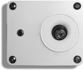
Telescope Encoder and Sky Sensor - WiFi (TESS-W)
The TESS-W is one of the outputs of the STARS4ALL, a project funded by the European Union Horizon 2020 Programme during 2014-2020. It is a compact device that runs on a 5V USB power connection and collects measurements of the night sky brightness using a light-to-frequency counter with a wide optical passband. It senses the presence of clouds by measuring the temperature difference between a sky-facing thermal IR sensor and a thermistor that measures the inside of the case. A lens over the sensor restricts the acceptance cone to 20º. Read the TESS instrument paper here.
|
|
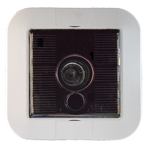
SkyGlow Wireless Autonomous Sensor (SG-WAS)The SG-WAS also uses a light-to-frequency counter and a lens to narrow its field of view, but it also handles multiple wireless communication protocols (LoRa, WiFi, or LTE-M) and derives its electrical power from solar photovoltaic cells and rechargeable batteries. Like the TESS-W, it includes a thermal IR sensor for measuring the "temperature" of the sky, which it uses to make a first-order guess about whether the sky is clear or cloudy. It can report for up to 20 days on a full battery charge, and if powered off can 'hibernate' for as long as four months. Read the SG-WAS instrument paper here.
|
Photometric passbands
The TESS-W and SG-WAS have different passbands, each of which is different to that of the most popular portable night sky photometer on the market, the Sky Quality Meter. The plot below (Figure 5 from Alarcon et al. 2021) shows the passbands of the TESS (solid blue line) and SG-WAS (solid red line) photometers, along with the passband of the popular Sky Quality Meter (solid yellow line). The B, V, R and I passbands of the Johnson-Cousins system are shown in dotted blue, green, red and maroon lines, respectively. The solid black line represents a reference night sky spectrum, showing the principal airglow lines of [OI] and Na I ("D"), as well as emission due to ro-vibrational transitions of the OH molecule.
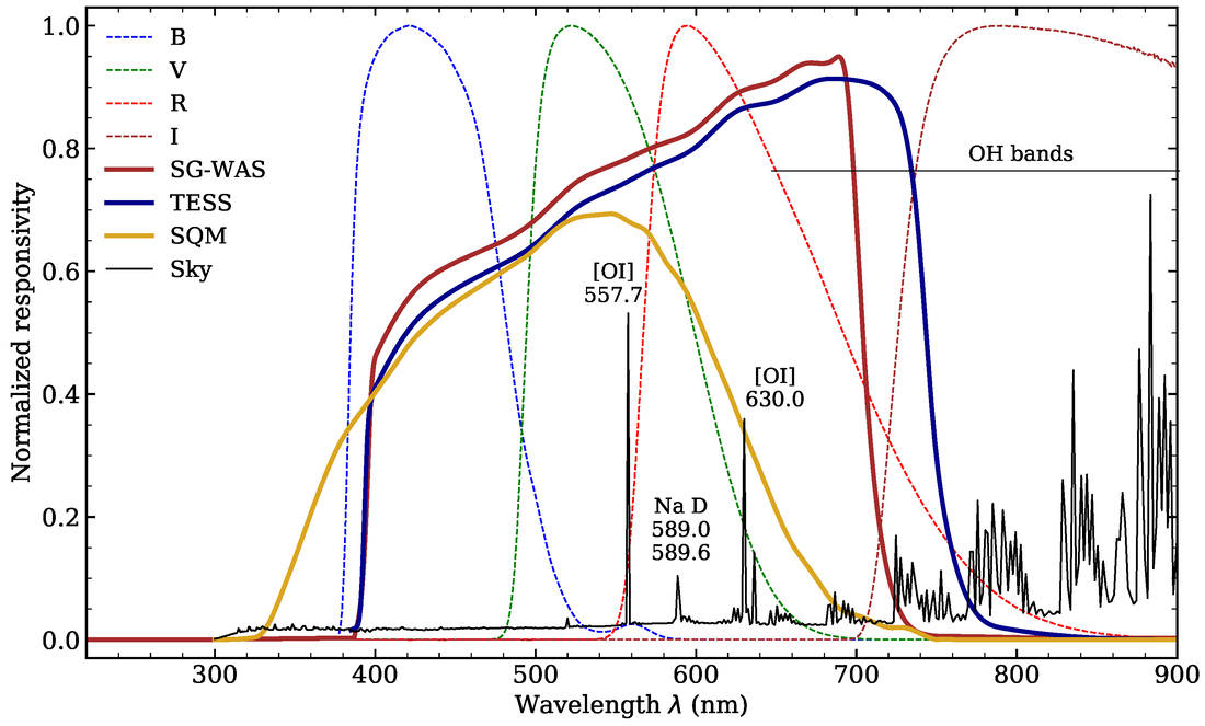
Both the TESS and SG-WAS passbands transmit more light at long wavelengths than the SQM passband, the latter of which was chosen to mimic the response of the human visual system. In particular, TESS is more sensitive to the OH bands than either the SQM or SG-WAS, and it often reads brighter than them under the same conditions. The SQM has more short-wavelength sensitivity than either the TESS or SG-WAS, meaning that it reacts differently under twilight conditions in particular.
Intercomparison
Given that the devices are running at the same location under identical conditions, I have compared their output to obtain a rough calibration. In the plot below, measurements are shown in the blue points. A linear least-squares fit is shown as a blue solid line with 95% confidence intervals in the blue shaded area. The solid black line represents where the measurements would fall if there were a perfect 1:1 correspondence between the devices.
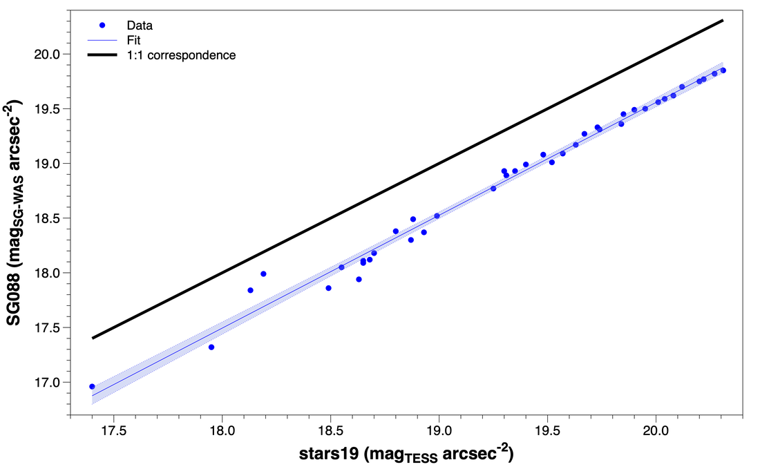
Over much of this range, which roughly represents the range of sky brightnesses typical of my site during astronomical darkness, SG_088 reads consistently brighter than stars19 by about half a magnitude. This seems to indicate a constant zeropoint offset rather than reflecting the devices' different passbands; under most circumstances, stars19 should read a little brighter by virtue of its wider passband. Accounting for the zeropoint difference, the two track each other well with a slope that differs only slightly from one (1.032). Accounting for random measurement errors, the devices are fairly comparable over several magnitudes.
TESS-W "stars19" live output
The following plots represent live outputs from stars 19. The first shows data for the past 24 hours. Three quantities are overplotted simultaneously: the measured zenith brightness (green), the "temperature" of the sky radiation (cyan) and the temperature of a thermistor inside the case (orange).
The next plot shows a week's worth of sky brightness data. The shape of the trace each night changes according to the moon phase and how clear the sky was.
The next plot shows the local altitude of the Sun (green) and Moon (orange) during the past week. It is positioned on the same temporal axis at the previous plot so the two line up horizontally. The Moon's percent illumination is shown in cyan.
The next plot shows a histogram of all data collected at the site since May 2017 under astronomically dark conditions (Sun at least 18 degrees below the horizon) and during times when the sky was probably clear (a large difference in temperature between the air and sky, indicating radiative cooling).
Analysis and statistics
The Internet of Things EELab (IOT-EELab) provides some simple, interactive analysis tools for both the TESS-W and SG-WAS photometers. The following plots are specific to stars19 due to the length of its dataset (~6.5 years as of this writing). The data were filtered according to these criteria:
Variable |
Value |
Dates |
2017-05-02 to 2023-12-22 |
Sun altitude |
< -18º |
Moon altitude |
< -5º |
Clouds |
σ (mag) < 0.01 |
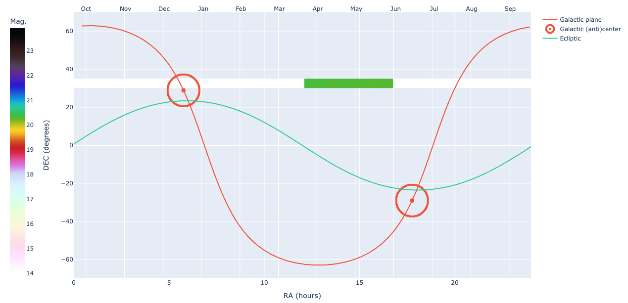
Galactic latitude in zenith |
|b| > 40º |
Ecliptic coordinates of Sun and zenith |
Variable, depending on the ecliptic longitude of the Sun and the ecliptic latitude of the zenith (see Fig. 6a in Alarcon et al. 2021) |
Outlier rejection |
3σ |
That leaves 18204 measurements represented in the plots below. First, a histogram of measurements in this filtered set:
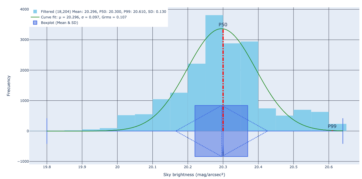
Descriptive statistics on the set are as follows:
Parameter |
Value (mag/arcsec²) |
Mean |
20.296 |
Median |
20.308 |
P50 |
20.300 |
P99 |
20.610 |
σ |
0.130 |
Brightest measurement |
19.86 |
Darkest measurement |
20.64 |
1st quartile |
20.23 |
3rd quartile |
20.37 |
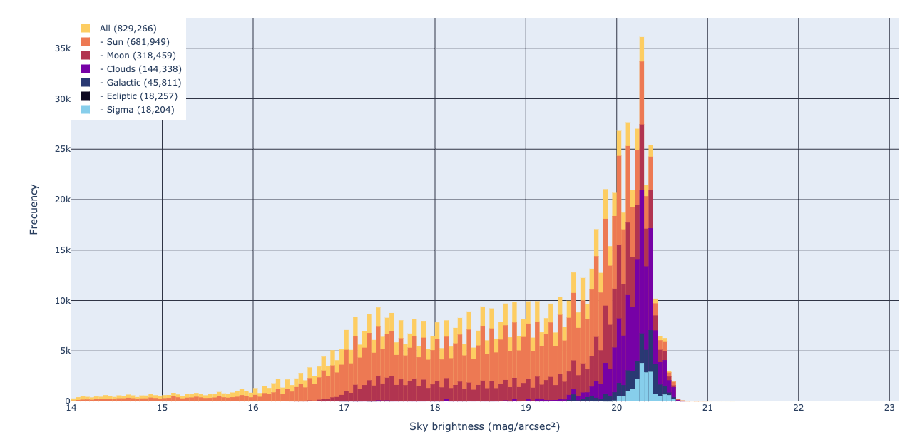
The next plot shows a histogram of all measurements showing the effect of applying the filters. The colors of each trace indicate the distribution of remaining measurements after each cut. The influences of the Sun, Moon and clouds account for almost of the non-Gaussianity of the distributions.
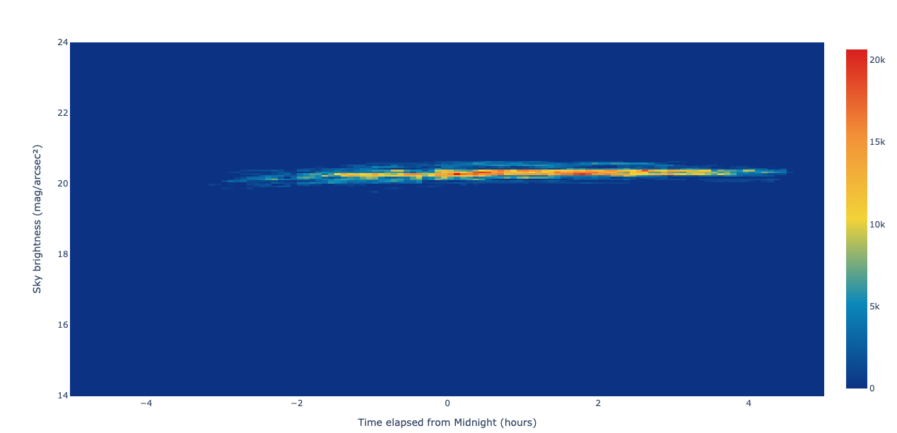
The next plot is a so-called "jellyfish plot" of all measurements. This is a kind of densitogram that plots the number of measurements in each of a set of bins of (time of night, night sky brightness). Warmer colors mean more measurements fall into a given bin, and the time axis is aligned so that local midnight always falls along the center of the x-axis.
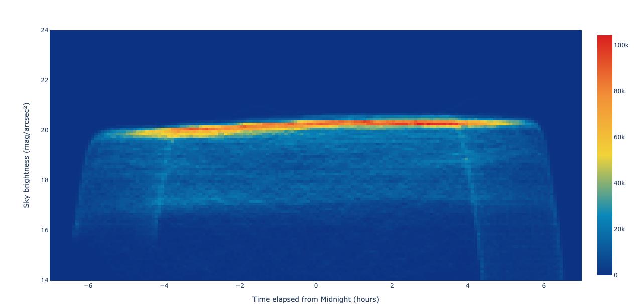
The bulk of the points fall roughly along a horizontal line near the typical clear-sky sky brightness (~20.3 magnitudes per square arcsecond). The "arms" of the jellyfish on either end represent the changing length of the night during the seasons, with shorter temporal sequences in summer and longer ones in winter. Cyan-colored pixels below the main bulk indicate nights with cloud and/or moonlight interference (or both). Since my site is located in a light-polluted area, clouds brighten the night sky rather than making it darker than the natural background level.
Also note the slight slant in the plotted points. That's a real effect, and it shows that the night sky gets a little darker in the hours after midnight. Again, being in an urban area, this is a reflection of human activity patterns. In any near cities, outdoor lighting tends to dominate the budget of light in the night sky and control the measured brightness in clear-sky conditions.
The next plot is a jellyfish plot of only filtered measurements according to the criteria listed above.
Now the distribution of remaining values reflects "ideal" conditions that best characterize the site.
The next plot is a heatmap of all measurements where the color of a cell indicates the measured zenith brightness on that date and time. Cooler colors mean darker night skies and warmer colors mean brighter skies.
The next plot is a heatmap of all measurements where the color of a cell indicates the measured zenith brightness on that date and time. Cooler colors mean darker night skies and warmer colors mean brighter skies.
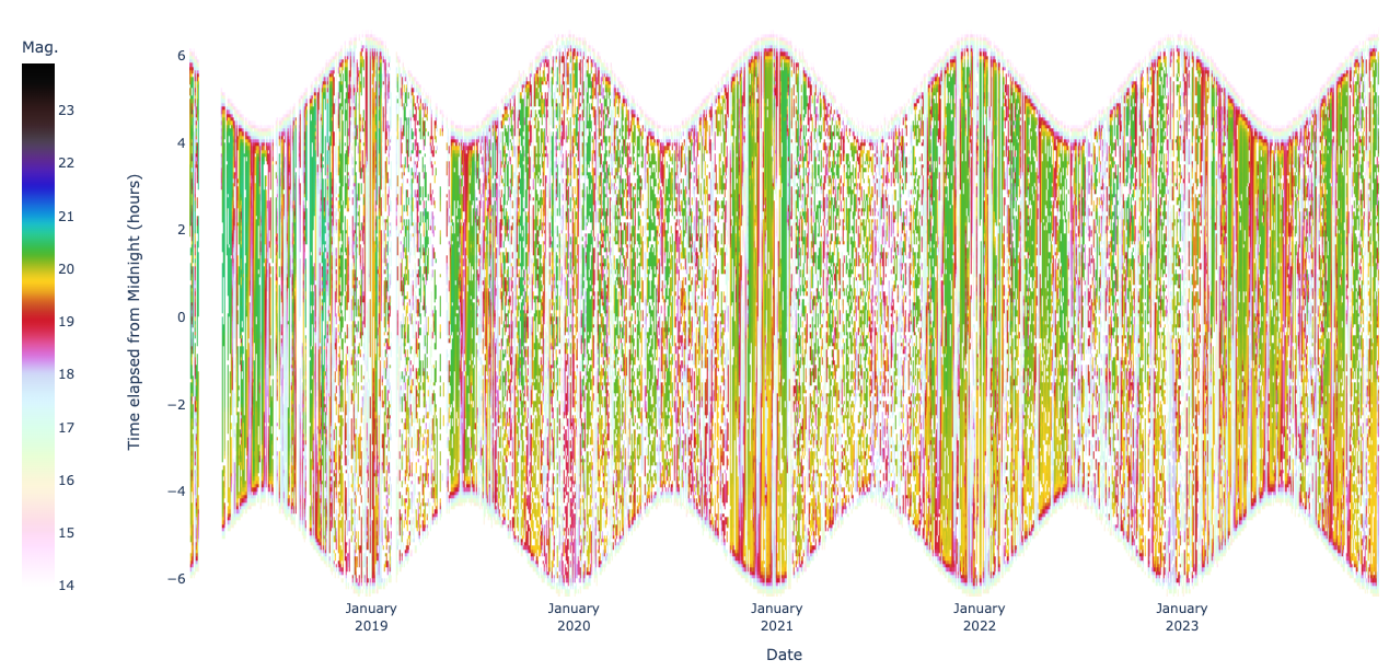
The "wavy" appearance of this plot again reflects the changing length of the night throughout the seasons. During summer, the distribution narrows in the vertical direction; in winter it widens as the nights get longer.
The next plot is a heatmap of filtered measurements:
The next plot is a heatmap of filtered measurements:
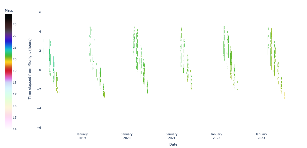
This plot tells us something about local meteorological conditions as well as the latitude of my site (around 32ºN). After removing all points from the raw dataset that include interference from the Sun, Moon, clouds and the Milky Way, the darkest months of the year are revealed: February to June. The swaths of points tend to get more dense as the months progress, as our weather is on average most consistently clear in late spring and early summer. At our latitude, one of the most dense parts of the Milky Way is in the zenith during much of the night from around June to September; on the other hand, the North Galactic Cap is in our zenith in around March and April.
The last plot is a "sky chart" of all measurements:
The last plot is a "sky chart" of all measurements:
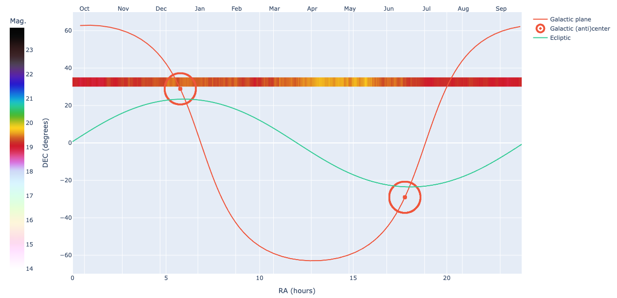
In this representation of the data, the field of view of the TESS-W is shown on a Mercator projection of the celestial sphere. The declination in our zenith is roughly equal to our latitude, so the data are indicated by the continuous strip of color in the upper third of the plot. The colors represent the zenith brightness as a function of right ascension. Because the declination of the North Galactic Pole (+27.4°) is similar to the latitude at my site, the sky appears to get a little darker in around April and May because the influence of light from the Milky Way is least during that time. This is particularly evident if the same type of plot is made that includes only the filtered data: